Learning Outcomes: Audience will be able to identify and describe environmental, economical, and societal impacts of food waste and identify some steps to help reduce waste.
I used a PowerPoint template that I found on HubSpot to create my food waste infographic. The choices of template are quite limited with the free version. However, I managed to find one that could work with my learning goal.
Below are my attempts to increase the effectiveness of the infographic by applying a few of the strategies and rules put forth by Dunlap Dunlap and Lowenthal (2016) and Balliett ( 2011 ):
TYPOGRAPHY HAS ITS PLACE
Since some audience may find the topic uninteresting, I used a fun and eye-catching font for the title to create some excitement. Lines were also used to break up the content.
TELL A STORY
My infographic consisisted of three components: an introduction (a problem statement), a support piece (impact of food waste), and a conclusion (actions). This aligned with Balliett’s (2011) suggestion to tell a story on your infographic.
VISUALIZE THE HOOK
I placed the hook (What can you do to help?) at the very end of the infographic to grab more attention. Balliett (2011 ).
AVOID WHITE AS A BACKGROUND WHENEVER POSSIBLE.
Although white background should be avoided, with the free template, I was not able to change it to a different colour. Given the background is not completely white, readers should still be able to read it. Balliett ( 2011).
RULE OF THREE
I used three primary colours on the infographic: white, green, and red. Balliett (2011).
USE RELEVANT IMAGES
I used relevant images instead of decorative visuals. Dunlap and Lowenthal (2016).
CLEAR FOCUS
I had a clear focus and purpose for my infographic – food waste impacts and what we can do about it. Dunlap and Lowenthal (2016).
LENGTH
My infographic was no longer than two pages long. Dunlap and Lowenthal (2016).
MALLEABILITY
I incorporated reflection prompts and questions to engage the audience. Dunlap and Lowenthal (2016).
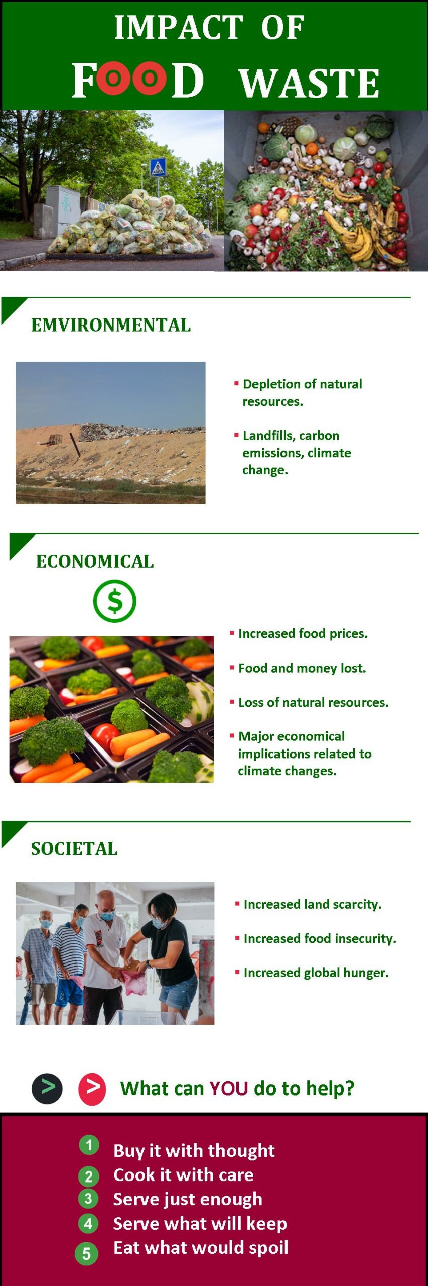
Below is a copy of the infographic:
References
Balliett, A. (2011, October 14). The do’s and don’ts of infographic design. Smashing Magazine.
https://www.smashingmagazine.com/2011/10/the-dos-and-donts-of-infographic-design/
City of Hamilton (2016). Household food waste PowerPoint presentation to Community Food Advisors.
Dunlap, J. C. & Lowenthal, P. R. (2016, September 8). Getting graphic about infographics: Design lessons learned from popular infographics. Journal of Visual Literacy, 35(1), 42–59.
https://doi.org/10.1080/1051144X.2016.1205832
Hubspot (2023)
Pennsylvania Committee for Public Safety. “Food Don’t Waste It.” Special Collections, USDA National Agricultural Library. Accessed February 17, 2023, https://www.nal.usda.gov/exhibits/speccoll/items/show/224.
Hi Chwen,
This a pretty good example of an infographic. In terms of size I would always argue you should look at two factors: if it’s going to be seen online does it read well when filling 60% of the width of the page (a common content area limit for learning management systems like Moodle or content management systems like WordPress); and if printed will it be readable when produced at the size available in your school (11 x 17, poster sized?).
You should always do a second scan for typos or errors in your graphic (‘lost of natural resources’ should be ‘loss of natural resources’). Coloured backgrounds add eye appeal and can be used to direct student view but I think this white background works with major colour elements at top and bottom as well as with each section. One thing you could do to make this infographic appear more of a single element online would be to put a solid border around it. If your template won’t allow it you can do it in HTML by adding the following to the image (img) tag – border: 2px solid black; to force a border around the image.
Hi Keith,
Thanks for your feedback. I have corrected the typo. I followed your instruction in HTML to put a solid boarder around the infographic, somehow it didn’t take it.